In the product world, mocks are a tremendously effective medium of communicating ideas to others. By sketching out an idea in a visual format (or, for physical objects, creating rough sculptures of the final design), a concept moves from the realm of ideas into the realm of possibilities.
But in what I’ve seen, there are two radically different approaches to prototyping designs. There are the high-fidelity mocks, which I will call pixel perfect mocks as well as rough and approximate mocks which I will call sketch mocks.
Here is an example in action. I’m currently working on a recipe web application to allow me to easily store and update recipes that I’ve found useful, but I want it to be super easy to use, particularly when adding new recipes. The functional needs for the widget involved in collecting the recipe are many — but I basically need to collect a quantity, a unit, and the name of the ingredient involved.
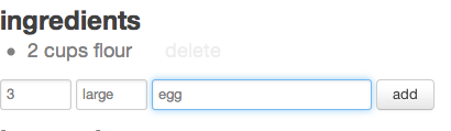
Here is a “pixel perfect mock” of such an input:
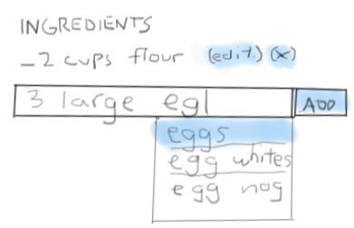
And here is a “sketch” mock of the same concept:
Which one do you prefer more? Well, that’s somewhat subjective. The greatest advantage about the pixel perfect mock is that it closely mirrors what the end user could actually be interacting with. Investors and executives also love clean and “done-looking” designs.
But that’s also one of the greatest disadvantages of precise mocks. They convey a sense of completeness — because everything is aligned and measured and proper, it leaves little space in the mind for creative exploration outside of the current state of the concept. Indeed, pixel perfect mocks lend themselves to being copied, since the easiest way to start out when doing precise mocks is to grab a screenshot of an existing mock, rather than starting with a new idea.
In this particular case, doing the sketch made me realize that even if it’s more work, it’s sensible to just have one input box for the entire line, splitting out number, unit, and quantity from that single piece of text. An autocomplete dropdown can be in a bunch of different places, and I can play with pre-filling the most likely candidates for what is being typed. It also took a lot less time to make the sketch mock, and I got to think more about the functional design rather than just graphical design.
Sketches also get people thinking about the right things — when too much care is put into an accurate visual representation, that is what will end up being commented about in discussions. People tend to focus on color choice, shadows, alignments, and spacings, rather than questioning the functional purpose of an element in a mock.
It’s great to sketch on pen and paper, but using a tablet connected to your computer, like the Wacom Tablet I recently bought is super easy and powerful as well. Sketching on a computer has the advantage of letting you quickly jot ideas down, but to then use the power of Photoshop or other programs to edit the sketches. The Wacom tablet even senses how much pressure you’re applying to the surface, making it really expressive.
“Sketch” mocks in the physical world are also tremendously useful. Famously, founder of Palm, Jeff Hawkins, walked around using a block of wood as his prototype of a palm pilot. He would pretend to take notes, schedule meetings, and check emails on the piece of wood. Surely, he could have paid for a more “accurate” mock up of a mobile computer, but for investigating the practical size contraints and practical availability of a device, the block was sufficient.
Jeff says it best himself:
“People thought I was crazy,” he said. “But I got a feel for how it would work.”