Graphic design is supposed to help communicate messages. Particularly in the realm of advertising, graphics are meant to engage potential customers, through creativity, simplicity, or an appeal to human desires. In the online advertising community, ads are sometimes called “creatives” for this reason — there are so many different approaches that can be taken to communicate the value of a product or service. But it’s amazing how often online ad design completely misses the mark.
Gratuitous flourish
Take, for example, this ad for Citrix video conferencing:

Clearly, some principles of advertising design are being followed here:
- There is a photo of an attractive woman
- The people in the photos make direct eye contact with the observer
- A button with a strong color calls for action
- The message is simple: High Definition Video Conferencing
However, while these concepts might be applicable in the general case, this ad fails to actually convey the message that the advertiser wants to convey — that the VC is indeed HD. First, the image quality used in the ad is quite low, which doesn’t suggest that the product itself has great quality.
Secondly, there is a black gradient overlaid on the bottommost photo. Now, you probably recognize this as an “effect” added by a designer, probably to make the images blend better with the unneccesarily black background, but for the great many people who spend half a second looking at the ad, it won’t seem that way. They’ll just see an obscured image, and thing to themselves that the video image quality is actually low.
As a result, a “creative” flourish added from the graphic designer really decreases the affectiveness and visual imppact of the ad.
Missing the big picture
Another pattern I see a lot is a lack of design consideration for the “big picture” design of a site. For example, note how the entire AOL homepage looked from a couple of days ago:
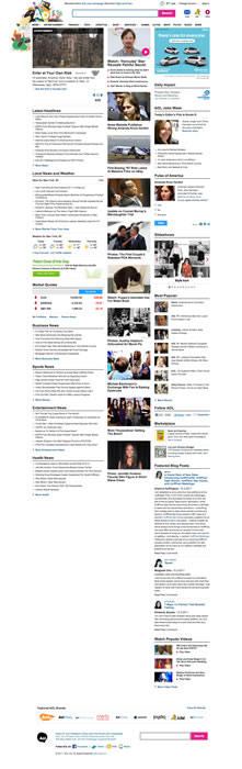
AOL brands itself as being a destination site, for people looking to read news, gossip, and see things going on around them. The designers did a great job in creating minimalist, readable components — each section is clearly delineated, and plenty of whitespace makes text readable. For the photo section, there are just photos and large titles — exactly what you are looking for when browsing for celebrity images.
But they failed to consider the whole template. As you can see, the bottom of the page is helplessly lobsided — the length of the columns isn’t matched properly, and the browsing experience quickly deteriorates.
I think this is somewhat of an artifact of the Model - View - Controller code bureacracy that many web frameworks have now, which splits design into two roles: - there are visual designers, who create visual styles through CSS and interactive components - there are template designers, who take data to be displayed on a page and give it structure.
So in AOL’s case, the effort spent in styling the page was almost wasted, because the page templates didn’t completely mesh with what was supposed to be displayed in them and the site looked broken. Thankfully, somewhere there noticed this and now the page looks better, but it’s a great example of how designers working without a sense of what the goal of the communication is can be ineffective at best and detrimental at worst.