Today I came across a talk by Joel Spolsky at Business of Software 2009 that addresses the tradeoff between simplicity and power.
There are two extremes. One is the blank text box like NotePad or TextEdit — just type text and it shows up. The other extreme is Microsoft word — almost a thousand different menu items to manipulate text in any conceivable way. The ultimate would be just to provide users with a programming language — “here, just make a word processor yourself” .
Design is actually the act of deciding stuff because and good designers design the right stuff, there is an easy way you can give people a word processor that has every possible configuration option.
Of note, many companies list “simplicity” as a feature, which Joel thinks is actually a symptom of lack of functionality that many startups and young consumer products provide. Here is a note taking system that will even store your notes when you reload the page, and best of all: it’s simple, and easy to use.
But useful simplicity in a system doesn’t necessarily mean that you can’t have features — it just means that the decisions about when to use and present features are made.
A great illustration of this is Amazon’s patented One-Click ordering system, which Joel mentions in his talk. It’s really simple, which has led some to question the validity of the patent: go on a product page, and if you have a credit card and address on file, you click one button to order an item and have it appear at your door.
This is the flow that typical ecommerce websites adhere to:
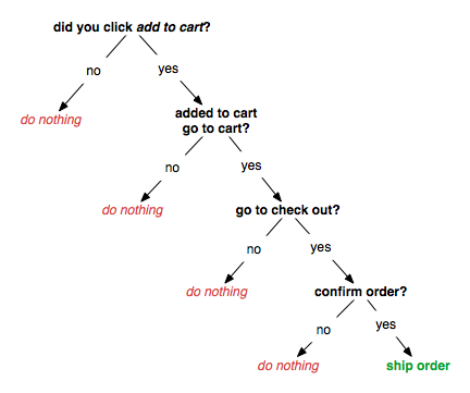
As you can see, there are a lot of decision branches where the result is “do nothing”, affecting the bottom line since a potential sale was not being made. If you’re into computer science, you’ll recognize this as the most unbalanced possible binary tree. The people over at Amazon got rid of most of the intermediate steps, and ended up with a flow like this:
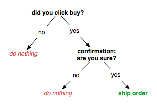
Concern that people might click accidentally led to the inclusion of a confirmation dialog. But Jeff Bezos was still not pleased. Indeed, chances are that if someone were to click this button, they had indeed meant to order the item.. only a small percentage of users made mistakes. Here is the true to name one-click purchase flow:
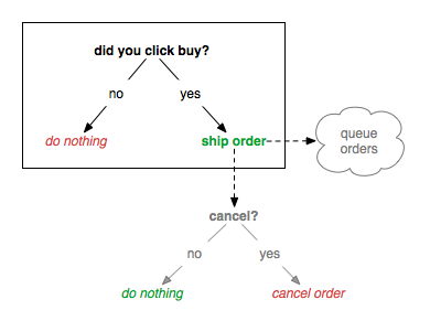
Here, Amazon made the user experience simpler, and also added new features. It’s just that the features are only presented for the users when they need them. The cancellation of an order can only be done after the item is ready to ship, which is when cancelation would make sense. As for process engineering, a whole lot of thinking had to go into creating a queue of items — they would want to bundle items if people ordered many in a short period of time to save on shipping, as well as allow orders to be cancelled without incurring costly return fees.
Metaphors
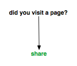
Facebook is trying to take this even a step further with “frictionless sharing”, which has struck a nerve with many. Basically, content will be shared on your behalf if you merely visit a page or play a song, even if it’s not on the facebook.com page itself. They are trying to get rid of the action metaphor of sharing altogether.
It’s really simple , per se, but most people I know derive satisfaction from taking the action of showing friends. When there is no action involved in sharing content, it loses meaning. It’s also a bit concerning when actions are taken in your name (posting messages to connections) that don’t address the goal you are trying to achieve (like reading an article or listening to a song).
At Amazon, they’ve gotten rid of the “shopping cart” metaphor. You just choose what you want, and it shows up at your door. In Japan, you might even get it the same day, and Amazon is experimenting in the US as well.
A lot of the metaphors we use in the digital world, like shopping carts, files, folders, pause buttons, and desktops might be a good way to increase familiarity for novice users (similar to how the original automobiles were called “horseless carriages” and had rein-like controls). To truly take advantage of technology, it’s important for us to add only the functionalities and metaphors that help directly address goals .
diagrams made with Omnigraffle