With the semester over and more time in my hands than I’ve had in a long time, I took some time to do the mindless Facebook crawling that everyone is doing these days — but thinking about it from a usability perspective. In the past few months, besides attracting very high valuations from investors such as Goldman Sachs, Facebook has overtaken other major sites, like Google, in terms of the percentage of internet browsing time that users spend on the site. See the following chart, from comScore:
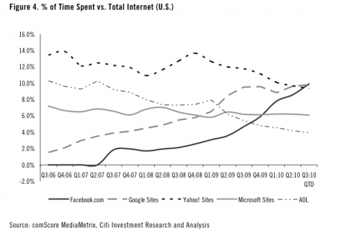
Although this chart is a bit shady (note that Facebook somehow dropped below 0.0% share in mid 2007), it does clearly illustrate a trend: more and more people are spending more of their time on Facebook, especially as Facebook expands its global footprint, replacing regional social networks with their globally connected network. Recently, a Facebook intern compiled a visualization of the connections between users and plotted it geographically, illustrating this Facebook spread. Most conspicuous on this map: the absence of any connections within mainland China:
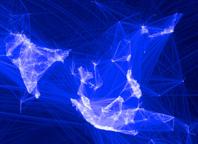
There is no doubt that this is the “last frontier” of social networking, and that whatever company does create a viable social site here will be very successful. Internet-enabled Chinese people have shown a great zeal for staying connected — the Chinese instant messaging service QQ has reported over 100 million users simultaneously online, which speaks volumes given that Facebook’s entire userbase is somewhat above 500 million users (although it is unclear as to how many of those accounts are for spam / bots). But, government reigns supreme, and Facebook remains behind the Great Firewall.
But, I digress: what is keeping the other 5 billion people spending so much time on the site? Here are some ways in which Facebook’s user interface contributes to this effect:
1. Trapping users in the Facebook world
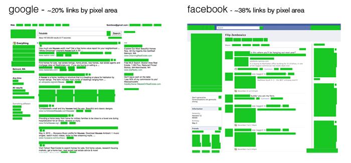
The UI on Facebook is a little cumbersome, which I think is intentionally designed to keep people on the page as long as possible. Here are some examples of what I am talking about: Below you see a Google search result and a Facebook profile side by side, with all of the link elements on the page highlighted in green — as you can see, this particular Facebook page has almost twice the number of links..
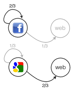
But when we analyze where the links are going, we find that for the Facebook page, 2/3 are links to other pages within the facebook network, whereas only 1/3 of a Google search results’ links are internal:
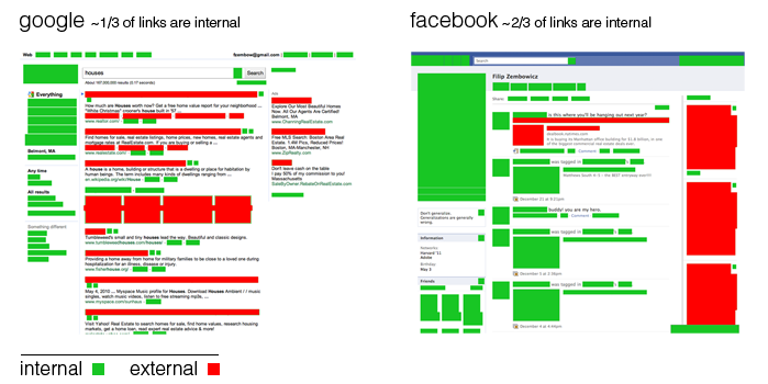
At a certain level, people browsing the web can be thought of as probabilistic machines that just click links at random (obviously a huge simplification, but an idea similar to this drives search result relevance algorithms such as PageRank). When thinking in this way, it’s clear to see that people will spend more time on Facebook: they are given more opportunity to do so, with the increased emphasis on internal links, resulting in a different transition probability that encourages staying on the page:
2. Keeping the mental model guessing
When humans interact with computers, there occurs a translation between a users’ mental model of a task to the appropriate interface model that they must use to accomplish a goal. So, an idea such as “I want to check what John has been up to” must be translated into something like: 1. click “Friends”, 2. type “John”, 3. click his link. Now, for many decades, the usefulness of having consistent user interfaces so that users can build up a mental representation of a computer system has been known (see this paper from 1985, for example), but in many cases, Facebook keeps users guessing as to how certain things happen as a result of user actions.
As an example, Facebook keeps a kind of limbo with the release of the New Profile, which is an updated profile that emphasizes the visual aspects of a persons’ contributions to Facebook, as well as making the profile seem a bit more like a resume with bullet-points about ones’ life. Although previous profile redesigns, such as the one in 2006 which brought the news feed, have consisted of major feature additions, this new profile upgrade seems to be focused on aesthetic and organizational changes.
However, in this update users were “empowered” by being given a choice of whether or not to update the profile: so now there are two different kinds of profiles you will encounter. Unlike personalization on other websites which affects only the user who makes the choice, a user’s profile update decision will be seen by others who visit the profile.
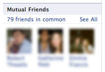
On some profiles, you will see your mutual friends on the left, displayed like this:
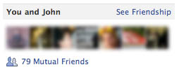
While on other profiles, you will see the mutual friends facepile on the right, rendered in a different way:
So in the end, there is just a kind of whirlpool: you will see lots of people’s faces in all parts of your screen, and you can always click them. The actual connection between what you are doing currently and what profiles and activities you are unclear, but you can continue just clicking faces and reading about things that may or may not be of interest to you.
This example is just one small example of how Facebook hides the user’s mental model from what’s going on – there isn’t really rhyme or reason as to why certain elements occur in different places on different pages.
The most prominent example of this is the privacy and data policy: it’s not exactly clear to anyone, what exactly is going on with all of your information. People have taken quite drastic measures to combat these privacy concerns: Extreme examples include young people concerned about their web footprint who “whitewall” their profiles every time they receive new updates, or just entirely disable their profile before logging off each time.
Probably in response to the criticisms about data privacy, you can now “export” all of the things you’ve uploaded to Facebook, perhaps to get a sense of how the data you’ve uploaded can give you a sense of what is going on. This gives you a rather useless data dump.
But there are many things that you will never see! - Facebook even has information about you even if you never have joined the network. Recently my mother joined Facebook and found that she already had friend suggestions from an assortment of people she vaguely knew in real life, such as people she has emailed like daycare workers or family friends. It turns out that those people most likely ran an email import for their contacts at some point — and even though my mom wasn’t on the network yet, hadn’t signed any privacy documents, nothing like that, she still already had a profile built up about her, waiting for the day that she would join. This isn’t really transparent to the end user, and contributes to the difficulty in understanding what’s really going on.
3. Difficulty in making anything go away
Most websites are designed to allow users to translate their intentions into actions in the fewest number of clicks. That’s true with Facebook as well, but not if what you are trying to do is somehow leave Facebook or a Facebook feature. Some examples:
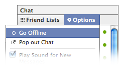
It’s really easy to sign in to chat — just click the ever-present chat box:

One would think that clicking this again would sign you out, which is not the case. Instead you must go through a menu, the not-entirely-intuitive Options menu, to sign out:
With friend requests, the same convolution is present: it’s easy to accept new friends (just click confirm), but rather cumbersome to remove people or delay accepting them. First, you have to click not now :

Following this you are presented with the following:
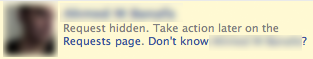
OK. So what do I do if I know this person but I don’t want to be friends with them on Facebook? I guess they will be put on the requests page. But where do I find them there? This tiny link seems almost an afterthought, tucked in at the bottom of the page and not emphasized in any way:
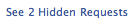
So the hidden requests will most likely stay here for a long time (I didn’t even know I had two hidden requests) — making it just the little bit more likely that some day they will actually be accepted. Even if I do click the “Don’t know ___?” link, I still have incurred an additional click, and can actually undo my decision. In the end, adding friends (and becoming more tied to Facebook) is a click away, whereas declining this request is confusing.
But the Facebook page itself is just the beginning — leaving Facebook is more and more difficult on the web as a whole. Now that many websites across the internet are using Facebook connect to personalize and connect users to their sites, it’s become rather unclear as to whether you are signed in or not at all times — the boundary becomes fuzzier all of the time, and the barrier to leave larger and larger. It currently even isn’t possible to automatically remove a Facebook profile, instead, the user is presented with a rather sentimental screen about how some of my friends will miss me when I leave. Of course, I can come back at any time, but this shows further how difficult it is in this interface to ever get rid of anything.
Take a look at Mark Zuckerberg’s “about me”:

Conclusion
While every major online presence has ulterior motives, especially when it comes to advertising revenue, it seems like Mark’s dream is only really true if it’s realized the confines of the Facebook platform itself, as dictated by Facebook. I’m not really a fan.