As an APM at Google, I’m encouraged to attend an industry conference once a year to learn about the latest technological progress and research. Since I like visualization and graphics, I went to this year’s SIGGRAPH conference in Los Angeles, which is the yearly conference of the graphics community. It brings together people from all fields: academia (think new algorithms for rendering), industry (eg. NVidia or Pixar), as well as art and design (such as animations and short films).
The conference begins with a whirlwind two hour presentation known as the “fast forward”, during which each of the 126 technical paper authors is given 45 seconds to overview their research. Most authors summarized their paper’s abstract, some performed skits, others read haikus, and one person even played a song on the ukelele, with the goal of attracting people to their presentations.
Due to the sheer number of events going on at the same time, I wasn’t able to see all I wanted to see, but here are some of the papers that stood out:
In Three-Dimensional Proxies for Hand-Drawn Characters, Eakta Jain and colleagues create a bridge between the artistic realm of hand-drawn animation and the world of computer animation. Compared to animating using a 3D model, drawing a character by hand allows for more expressivity, such as disobeying traditional laws of physics or object constancy. For example, an animator can lengthen a limb during an action to achieve a particular effect on the viewer. However, a drawback to animation is that it’s time-consuming to redraw an entire series of frames just to change a small part of the animation, like the material properties of a piece of clothing.
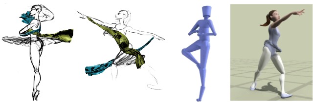
To address this, the researchers created a system that identifies points of importance on a hand-drawn sketch and matches them to a database of motion capture and 3D models. By then reanimating the model and overlaying a physical simulation on the existing animation, it’s possible to tweak parameters like the gravity affecting a dress without having to redraw the entire series.
Doersch et. al’s What makes Paris look like Paris? was a fun work of visual big data research. Using images taken from Google Street view, the authors looked at what patches of images were both common as well as unique to particular geographic regions. After running an tweaked SVM model that chose only the best matches per cluster of patches, they were able to identify subtle details of architecture and environment that were highly discriminative and memorable. Here’s an sample of the Paris patches:
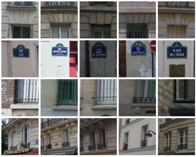
Extending their analysis, they were even able to identify regions within Paris that were self similar, displaying architectural “citations”. It’s wonderful to consider the possibilities of further “computational geo-cultural modeling” (their term) when applied to broader geographical regions, particularly when it comes to generating new artifacts. Imagine a 3D modeling software that allowed you to increase the “European-ness” of a model by mixing in some of the visual motifs present in that region…
Youyi Zheng et al. blew my mind with their paper Interactive Images: Cuboid proxies for image editing. By making a few key assumptions about a photograph, such as assuming coplanarity of objects and a flat ground surface, they were able to perform 2D/3D analysis to generate box-like proxy objects for items in a scene. Then, by using image decomposition and manipulation techniques, along with some clever symmetry tricks, they were able to utilize these proxies to manipulate the image in logical ways, such as resizing the cuboids by their faces or moving them around the plane.
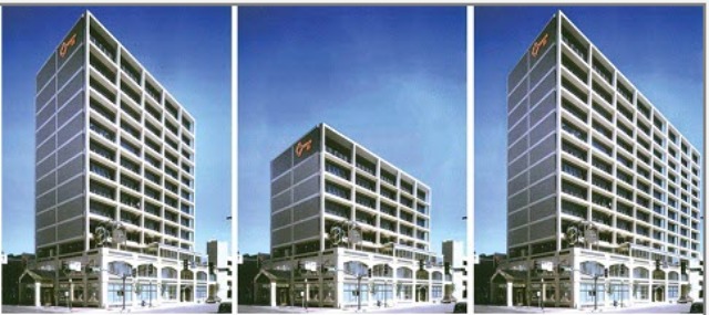
To evaluate their method, they performed a ground-truth validation whereby they edited two images into one another, before and after performing the intended manipulation in the real world. Besides some subtle problems with shadows, these images accurately reflected one another. The ease with which they can identify and manipulate simple objects is remarkable, and with some basic user input (to add some semantics by specifying a joint) they were even able to model the closing and opening of a laptop.
One of the more playful papers presented, Beady: Interactive Beadwork Design and Construction applied computer graphics techniques to assist real-life craftwork creation. Presented by Yuki Igarashi, the system consisted of a simple 3D model generator, as well as a clever algorithm to compute a route for a wire to holds beads together. After the computation is complete, the user is given step by step instructions for how to create the figures using wire and beads. She even brought a few of her models, including the famous Stanford bunny, along to the talk:
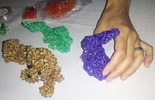
This was particularly novel — many of the other fabrication talks consisted of methods for optimizing 3d printing, a trendy technology today, but Beady brought graphics into the physical realm in a completely different medium and to crafts-lovers who might not usually benefit from graphics innovations.
How do humans sketch objects? To answer this question, Mathias Eitz and collaborators give some insights into what might be at play when we try to draw the things around us by training a computer to do so. They found that humans are quite accurate (~76% of the time) when classifying even poor-quality sketches. Knowing this, they collected a large amount of sketch data from mechanical turk, and trained a classifier to identify new sketches with decent accuracy (56%). They did so by training an SVM on a bunch of local sketch features, which is able to identify images such as the following.

To encourage readers to experiment with the classifier they trained, the authors created an iOS app where you can see sketch recognition in real time. I encourage you to check out “WhatTheSketch” if you have an iPhone or iPad:

I do think it’s a bit of a shame that the app doesn’t ask users to correct incorrect classifications (or to verify correct predictions), especially since often times the true class of a sketch is one of the top predicted classes: it would provide the authors with a wealth of additional data about their classifications.
SIGGRAPH also had a fun session called “fun with video”. Here, Jiamin Bai et al presented a paper called Selectively De-Animating Video. Part graphics and part HCI, their interactive system asks users to mark up a video into regions that should be animated and those that should remain still. Using this input, they warp the video to remove big movements from the video, additionally compositing the video with still frames using a graph-cut algorithm in order to not distort its overall appearance.
Enjoy the teaser video, even though the music is a bit corny :)
These are just six of the 126 papers presented at the conference. For a quick glance what’s going on in the graphics community, take a look at the first pages of each paper. Or, attend next year’s SIGGRAPH :)