Here’s a little experiment in data graphics — removing the “map” from geographical information visualizations. The rationale was this: we are already familiar with maps, and the actual shapes of the borders between places aren’t really necessary to understand some other type of information we are interested in studying. Drawing borders may very well just be adding to the clutter on our perceptive field. However, abandoning the information contained within geography is foolish — familiarity with location allows us to use maps to quickly find what we are interested in.
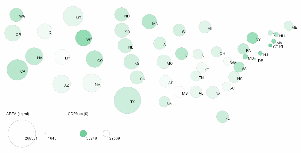
To make this, I scripted to draw circles at the geographic centers of the states, and then sized them depending on the area of the state. The color intensity is proportional to the GDP per capita of the state.
Now that there is less ink on the page, the image could be embellished with additional elements, for example by adding links between neighbors indicating levels of traffic, or trade, or flu spread, etc…