Anyone who has spent much time with me (or has done a design thinking interview with me) knows that I enjoy thinking about the challenges of transportation. The global transport network is filled with complex design problems, dealing with the real world of crowds, delays, weather, misunderstandings, and is consequently rife with interesting design solutions. When we travel, we’re particularly attuned to both the ease of transporation and differences in our environments: here are a few observations from my most recent jaunt to Asia.
Planning a route
Public transport is quite literally a means to an end, and translating from an end destination to the steps required is the first step to a successful experience. In the language of human-computer interaction, a user of a transporation system needs to cross the gulf of evaluation, understanding the parameters of where they currently are and where they need to go, as well as the gulf of execution, namely the actions that must be taken to reach that destination.
![]()
As a start, Japan and Hong Kong have nearly ubiquitous WiFi within subway stations, with a simple onboarding process for registering. This eases planning for both travelers without Japanese SIM cards as well as locals who’ve lost cell phone reception underground.
The official Tokyo Subway Navigation app is very well done for tourists. Not only does it work offline, but it allows for looking up routes by landmarks in addition to station names. Transport is, of course, a means to an end, it’s rare that your journey is actually to a station rather than to a destination nearby.
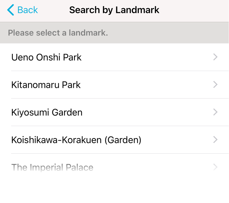
Navigating stations by landmark
I would, however, choose a different experience to show users when first opening the app—as it is, the app shows the entire subway map at once. This is not only not useful, but quite a bit intimidating; not a feeling you need as a tourist.
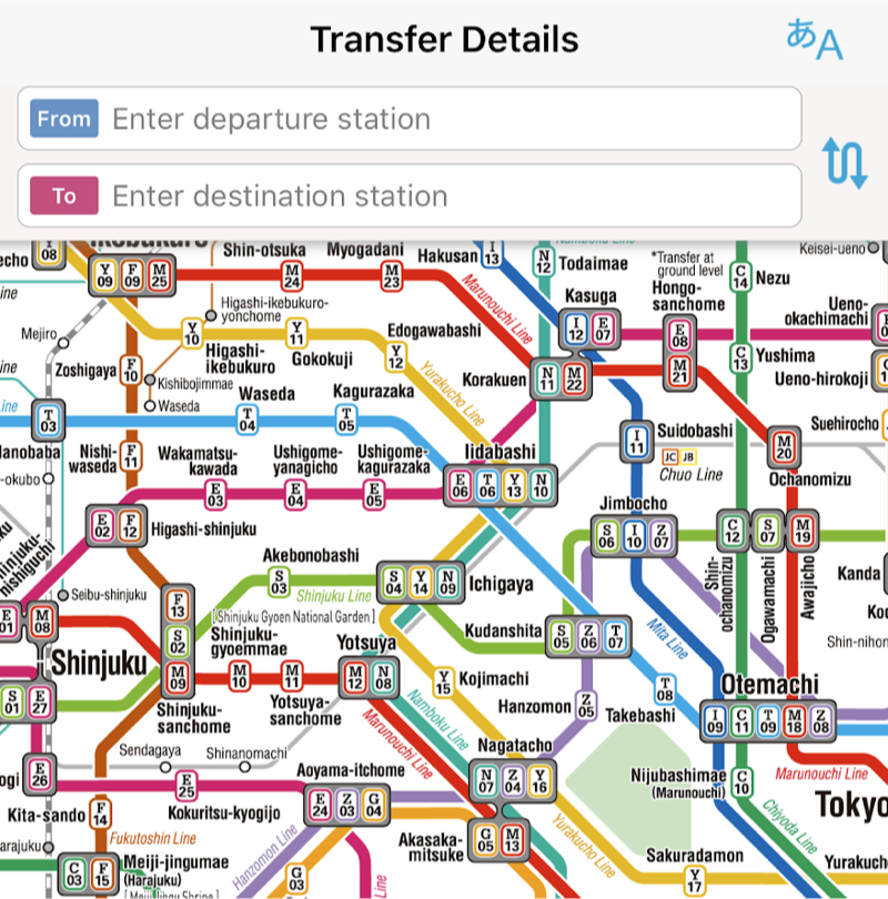
Overwhelmed by the map
Pricing & purchasing of tickets
The Tokyo, Kyoto, and Hong Kong subways all have a tiered pricing system where riders pay more for riding longer distances, like there is in Washington, DC. This might be more efficient from the point of view of economics, but it places a burden on users to correctly infer their cost (as well as to keep their ticket with them for the duration of the journey). Tools to simplify this were in abundance.
The Hong Kong MTR system ticket machines have a selection mechanism whereby you directly tap which station you are going to, obviating the need for you to translate your start and end station into which zones you are traveling between.
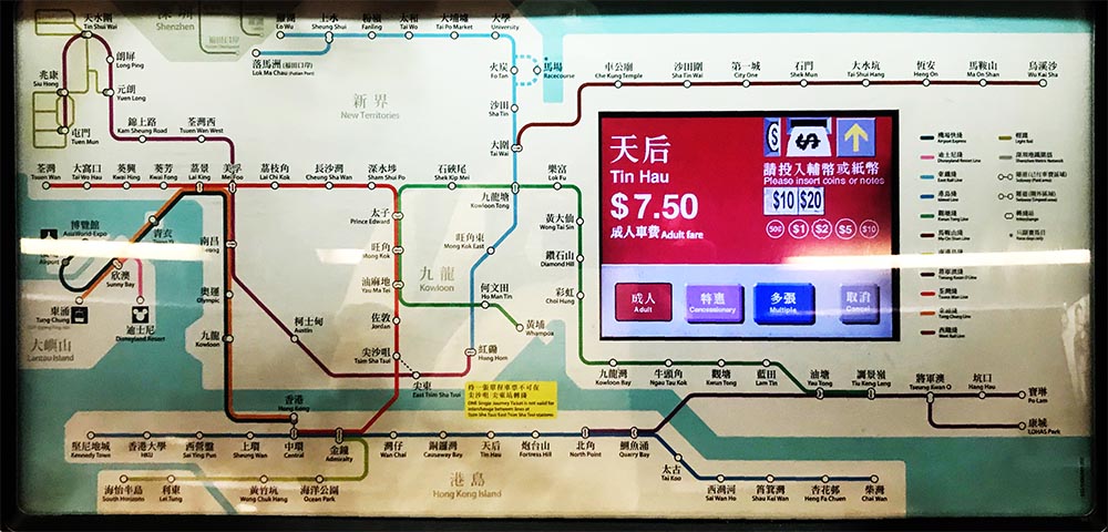
Pricing after tapping destination in Hong Kong
In Japan, even some buses have zone pricing. This is somewhat less easy to understand since there isn’t much to help associate stops and zones before you board, but the current pricing relative to the zone at which you embarked is always visible.
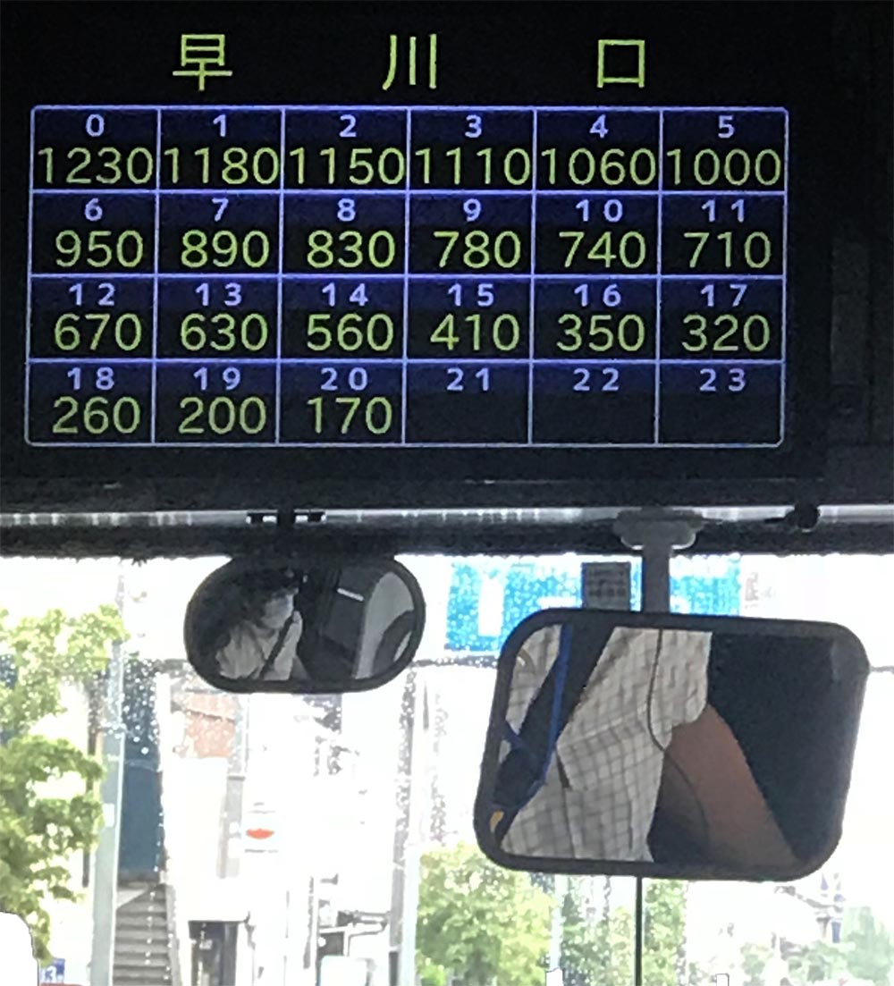
Bus pricing displayed by boarding zone
Orienting yourself
Once you’ve paid and are in a station, you need to ensure you’re on the right train and going in the right direction.
Numbering of stations within each train line is a fantastic cognitive aid in the Tokyo subway.
Numbered stations (G01 - G19) along a Tokyo subway route
Ascertaining whether you’re going in the right direction is trivial by seeing if the station numbers are ascending or descending. Especially with the difficult-to-pronounce station names, knowing how many stops are left to your destination becomes a matter of basic subtraction rather than language understanding.
A Tokyo transfer represented with station numbers
The entire system uses this numbered scheme, including the aforementioned phone app, making it simple to understand directions without even understanding the place names.
New York city too famously consolidated its design standards due to the help of Massimo Vignelli (something that may be familiar to you from the documentary Helvetica), but standardization of typography is not sufficient to making a transporation system usable. Helvetica has been around in NYC subways as long as I’ve been alive, and design standards and opportunities have evolved since then.
Safety
Many stations in both countries have glass panels separating the platform from the tracks, something that is also common in subway systems with automated trains, such as that in Paris. Undoubtedly these prevent some accidents involving people falling or jumping onto the tracks. The placements of the gates also provide hints for where to queue on the platform, resulting in a more orderly boarding process.
Glass barriers as a queueing cue
Of course, not all problems within stations can be solved through infrastructure: people also need to be paying attention. In the Tokyo metro, along with many pointers on escalator best practices, there were a great number PSAs telling people to not use their phones in the subway while walking.
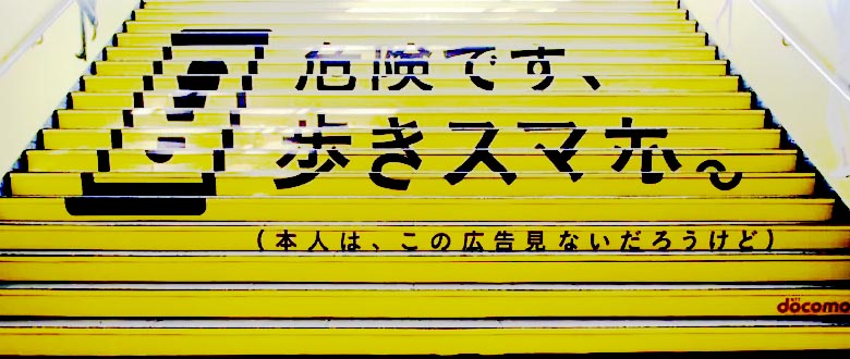
“Walking while using a smartphone is dangerous” (source)
Leaving trains and transferring
In a journey involving multiple trains, it can be stressful knowing when you must transfer and where to actually go.
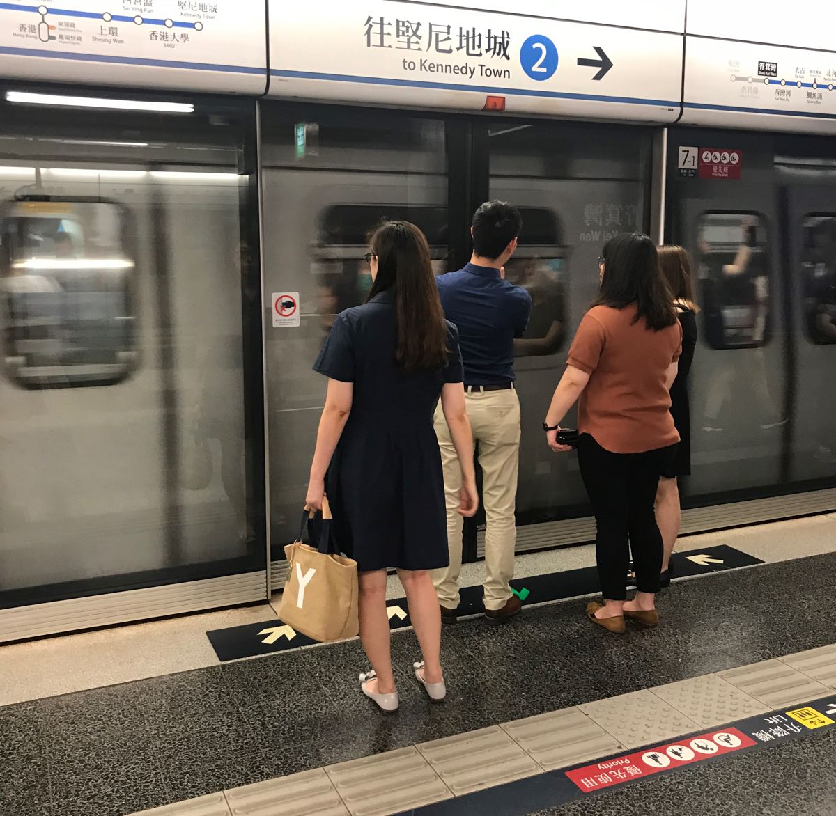
The Hong Kong MTR has handy transfer and direction indicators on train maps within train cars, wherein lights indicate not only the train’s current position along the train route, but other stations that you can reach by transfering from the upcoming station. You’re also shown the correct side of the train to disembark from to be better prepared.
Lit-up train lines indicating where you can transfer in HK
In Tokyo, the in-car display show not only your position along the train line itself, but the location of your car relative to the trains and the exits in the upcoming station along with easiest access points to connecting train lines. I’ve only seen this applied to the NYC metro in the Exit Strategy app, which assumes that you’re leaving a station—not surprising, because this is someone’s personal project rather than something maintained by the MTA itself.
Your position relative to the train and exit escalators
Once you’re out of the train, Tokyo displays walking distance indicators to other train lines and station exits exists. This is still somewhat confusing in massive stations like Shinjuku, but it’s a great orientation mechanism.
Walking distances to connecting trains shown above a walkway (from biz-journal.jp)
Exiting stations
Upon arrival at the final station, riders must reorient themselves in the real world. Most transportation maps are not geographically accurate but are diagramatic (check out my own writing and interactive work on non-representative subway maps), exiting requires translating subway-land into street level.
In the two cities, exits are always labeled or numbered, along with descriptions of which roads and landmarks are within close proximity. Rarely did I find myself needing to cross major streets after leaving stations thanks to these navigational aid within stations.
Station exits numbered and mapped in HK
Particularly in larger stations like Tokyo main station, many stores and restaurants are located directly within the train station itself, so you might not want to leave a station immediately. Many people are surprised to learn that famous restaurants like the one portrayed in Jiro Dreams of Sushi are located within station. The stations are not only clean, they are full of establishments, both famous and mundane.
The large mall below Tokyo Station
Like with the indicators of station exists, there are many maps to help locate businesses and points of interest within stations.
3D diagram of shop locations in a smaller HK station
Reliability
It’s hard to understate how reliably trains come and go according to the schedule. If a train is scheduled to leave at 5:45, you can bet that it will arrive exactly then. Any delays are immediately apologized for, even if they are momentary pauses between stations: communication contributing to the creation of a feeling of trust between rider and provider.
Notably, neither in Japan nor in Hong Kong do transportation services operate 24 hours a day (they are closed between ~1-5 AM). This likely contributes to safety, as homeless folks aren’t using the transportation services as housing, but also allows for construction to happen overnight, keeping the systems very well maintained.
Doing construction without needing to worry about passengers or passing trains also allows for absurd feats like changing an above-ground train into a subway line in four hours:
Next time you’re stuck underground for 20 minutes in NYC, or in a traffic jam in LA, think about how things could be better. The combination of high usability and availability make public transportation in Japan and Hong Kong qualitatively different than our patchwork transportation infrastructure in the states.
Which city does it better?
Who wins? Tokyo or Hong Kong? It’s hard to pick a single winner. But one thing’s for sure: the US loses out here. If we had spent more of our money on building and maintaining thoughtful infrastructure for our own people instead of stirring up wars for decades, we too could have it nice.