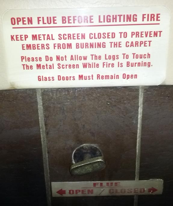
On the Google NYC ski trip last week, we found this stern warning on a fireplace:

Despite the red ALL CAPS severity of the warning, the control was completely ambiguous. What is a person supposed to do when presented with a rotating control, and linear directions? If you get it wrong, you might fill your entire house with billowing smoke.

This is a prime example of a mis-matched affordance. An afforance , in design, is something about an object that compells us to act on it in a certain way. A wheel affords turning, because in our experiences wheels have been difficult to push, pull, or otherwise interact with beyond turning. Similarly, a lever or a switch affords linear motion, because we know that it can’t move in any other direction.
But in the above case, the label and the control have mismatched affordances — the label is linear, while the control only permits rotational actions, resulting in this conundrum:

We thought the rightmost option were more likely (due to the positioning of the label and the effect of proximity) but we found out a few minutes later that it was in fact the other.
Another problem that plagues fireplace flues is that the state of the system, eg. “Is the flue currently open or closed?” is impossible to read at a glance. At best, you can light a small fire and see whether the smoke rises vertically.
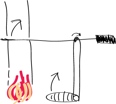
Good systems display their current state at a glance — the small red light on your TV tells you that it’s plugged in, just like the trash can on your mac is filled with paper when non-empty. I don’t understand why fireplace designers don’t learn from these principles… here is one possible solution:

You can immediately tell from the position of the handle what state the flue is in. The weight and resistance of the lever indicates even to a blind person what position is which. And it might even make the labels entirely redundant, just like well designed doors don’t need a “push” sign if they have a plate.