I like the positive changes in packaging design in recent years — successful products provide users with a pleasant total experience, including opening the box. Boxes for consumer products are no longer an afterthought designed according to the aesthetic principles of warehouses.
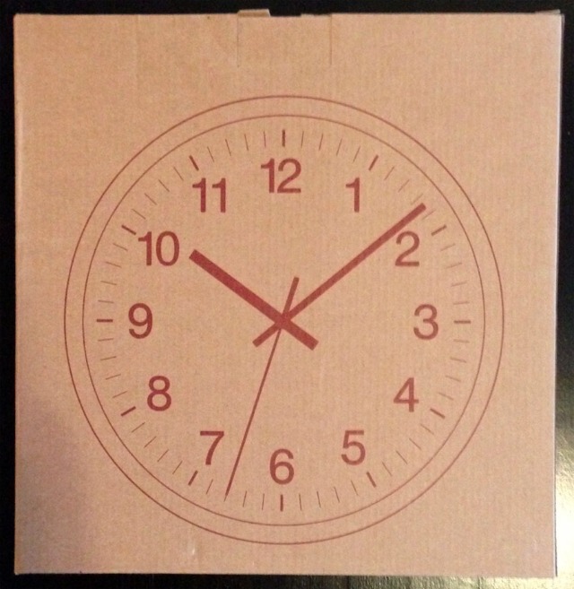
I bought a clock today at MUJI that pleasantly surprised me with its packaging. An illustration of the clock on the outside of the box makes what is inside obvious, leaving no need to fuss around at the store finding labels on boxes. It’s also aesthetically pleasing:
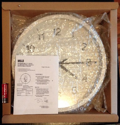
A battery and a screw for hanging are included inside, alongside the clock. It’s a good holistic process design — people opening the clock might not have a battery or screw handy, and the included ones allow the user to continue the task of setting up the clock. It’s a similar design to how IKEA always includes the screws and miniature tools for furniture assembly.
Even though the box includes the battery and screw, successful installation depends on the buyer having a screwdriver available. That’s a reasonable thing to assume, since IKEA does the same, and the clock will already be working at that time, perhaps not yet attached to the wall. There are numerous workarounds, such using a hammer and nail or just propping up the clock somewhere.
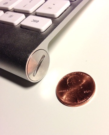
There are some other interesting approaches to the issue of depending on tools, such as the Apple wireless keyboard, which instead depends on a coin around to open the battery compartment (my guess is that the set of people with coins is a superset of people with screwdrivers):
Notably, the MUJI design doesn’t depend on fancy materials — the box is standard cardboard. The company is known for it’s practices of sustainable design, part of a design goal for simple products that they call product fitness. Even though the box is sturdy and double-walled to ensure that the clock arrives in one piece, it’s still simple to take apart for recycling:
I like Muji’s box design because it’s very functional in a holistic sense.
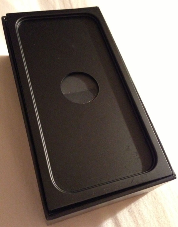
Apple is another company that gets a lot of praise for box designs, particularly because they tend to polish the opening experience and make it an almost emotional moment for the purchaser. Since phones are so complex, it’s a much more difficult task, as many people might feel intimidated during their first experience with a “smart” phone.
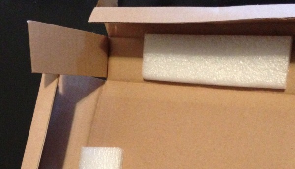
The materials used by Apple are more expensive and customized, but I do feel that their designs sometimes prioritize aesthetics over usability or sustainability. As an example. when I got the iPhone, the tab to access the cables stored under the phone was inaccessible in my box (it hadn’t been popped out), and the only way to access the contents was to dump them onto a table:
Perhaps it isn’t a flaw of the design itself, and my particular box hadn’t been properly assembled. But it goes to show the importance of maintaining quality in every step in the packaging process, including the manufacturing of the box itself.
Both the iPhone and the Muji clock mostly ready to go once purchased; gone are the days of having to charge something overnight or run to the store to buy batteries, as devices come charged and ready to use.
In this vain, the setup of the Muji clock can still be improved. The clock could already be running and set to the right time inside of the box. But given the complexity of synchronizing time zones and daylight savings in a global supply chain, it seems like the current box experience here is a good tradeoff between ease of setup and cost.
Perhaps in a future shopping experience where a lot of the boring, repetitive work of employees is automated (eg, sitting at the cash register), employees could do tasks like setting the clocks, to improve on the personalized, positive first experience for customers.
If you want to learn more about the world of packaging, check out the fantastic packaging blog The Dieline