Pay attention to the fluidity of your own abilities based on your context: you benefit from accessible technologies more than first meets the eye (or ear).
Elements of accessibility in design sometimes stand out for only serving the particular disability they accomodate. Particularly when explicitly labeled, it’s easy to other the groups of people who benefit from an accomodation and say things like oh, that’s for blind people or that’s a wheelchair ramp.
Some reserved accomodations, like parking spots for the handicapped, are explicitly off-limits to those who do not have a specific disability. And more complex approaches, such as using Braille to understand a sign, aren’t useful for people who can see on their own due to steep learning curves and the relative ease of direct perception. But often everyone benefits from accessibility in our daily lives.
The oft-cited example of an accomodation that everyone benefits from is the curb cut: the small ramp cut into sidewalks which was introduced to help wheelchair users at intersections (with it’s associated story of Oakland activists smashing sidewalks with sledge hammers, which you can listen to on the podcast 99% Invisible).
Anyone who’s pulled luggage, pushed a baby stroller, or ridden a bike knows that these ubiquitous ramps are useful far beyond their original purpose.
Many accessibility design elements have an impact beyond their intended user base, something you notice if you look for it.
Device distration as temporary blindness
Many intersections around the world have auditory systems to orient blind users in the world and tell them when it’s safe to cross.
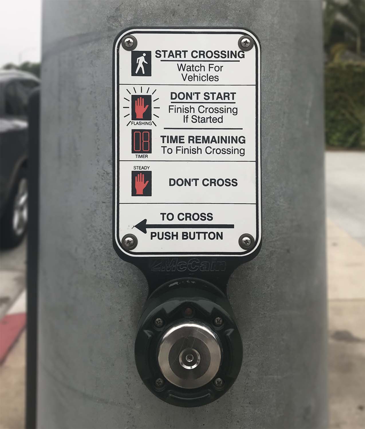
In Santa Monica, California, an announcer describes the cross streets, while beeps from across the walkways give an ability to echolocate direction:
Wait to cross Ocean Ave at Santa Monica …
Walk sign is on across Ocean. 5, 4, 3, 2, 1.
Even with full vision, our lived capability of perception varies due the fact that our brain’s spotlight of attention can change. When you’re buried in your smartphone, you’re effectively blinded to the situation on the street as you depend on your less-sharp peripheral vision at the same time that your cognitive attention lies elsewhere.
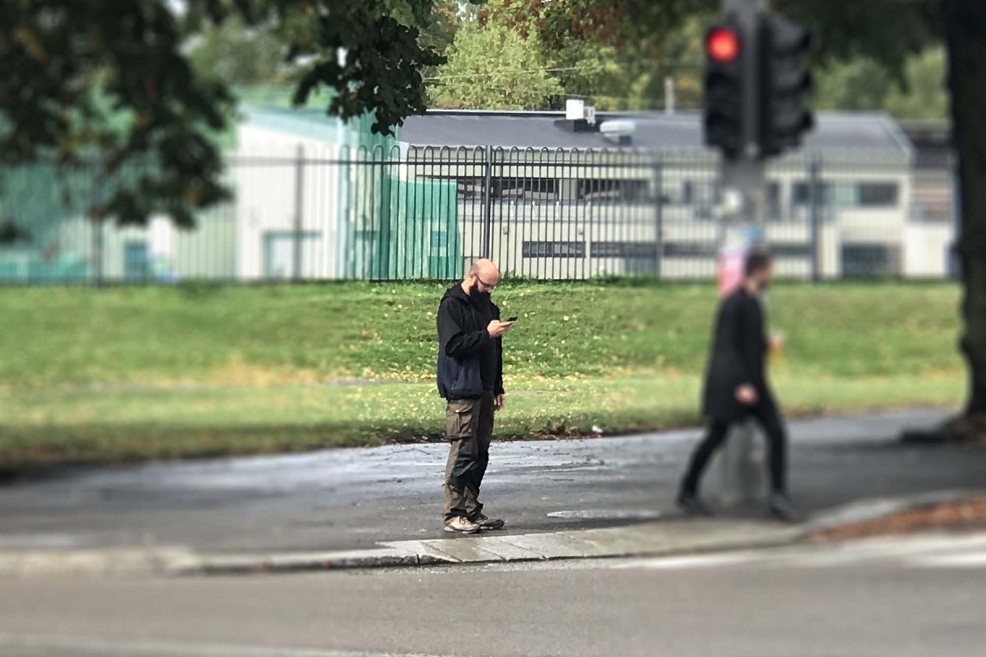
Auditory signals can help completely able-bodied crosswalk users whilst they are distracted by using another sense to convey a change in status. Your eyes may be on your phone, but your ears will hear a change in sound when your attention is required.
The challenge of depending on only one sense for understanding when it’s safe to go has led dozens of (most likely fully-sighed people) on Twitter to jokingly ask for a green light notification on their phones.
By the way, if you’re interested in reading a fascinating book about parenting of children with different abilities than their parents (eg, blind children of sighted parents), you’d enjoy Andrew Solomon’s book Far From the Tree.
Typography and vision
While the overwhelmingly San-Francisco based, affluent designers of digital products have many biases, their young ages and associated excellent vision are problematic for accessibility. According to the American Optometric Association, problems with seeing clearly at close distances begin in the early to mid-40s. Unlike something like blindness, which most people never deal with individually, the majority of adults will live to an age where their vision begins to deterioriate.
A blessing in disguise for my own life was developing a (admittedly small) need for glasses in the past few years. This has allowed me to, when I want, not wear my glasses, and see the world with aged eyes. It becomes abundantly clear that larger, more readable text sizes, and the avoidance of low-contrast thin fonts and grays-on-whites critical when building products for users that aren’t 27 years old and sitting directly in front of a 4K monitor.
See Your Body Text Is Too Small for more interesting discussion of why font sizes tend to be so small.
While we often stumble upon accessible experiences in the world, it sometimes makes sense to seek them out explicitly:
Accessible experiences as focus tools
Given the sensory overload that we’re exposed to every day, in some situations, sensory disabilities and their associated accomodations can be an advantage, even to fully-perceiving people. I had a deaf coworker with a cochlear implant who would savor the ability to be able to turn off his hearing for focus—and had no problems communicating with others in noisy night clubs using sign language while hearing people shouted at one another.
Many perceptive accomodations reduce the number of streams or volume of information of an experience (eg, larger text means there’s less text on a screen). It’s no wonder that approaches like changing phone screens to grayscale, a feature built for accessibility, have found some popularity more generally.
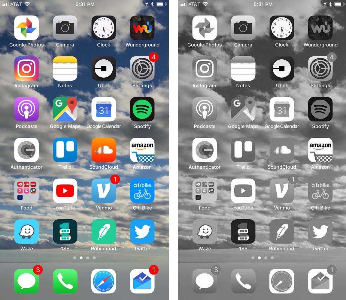
Grayscale reduces distraction for fully-sighted users